

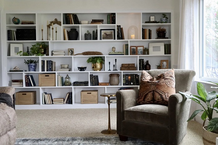
Flip through nearly any contemporary design magazine, and the bookshelves tend to share a suspicious uniformity. You will see identical ceramic arches, stacks of crisp linen-bound volumes nobody reads, and ubiquitous brass jack sculptures picked up from big-box home retailers. These vignettes photograph cleanly, but they often lack the warmth, oddity, and lived-in authenticity that make a home compelling.
A bookcase should not look like a retail showroom staging wall. At its best, it operates as a visual autobiography—a dynamic composition of the stories you cherish, the places you have traveled, and the quiet objects that have caught your attention over the years. Achieving an elevated, editorial look does not require an afternoon shopping spree or an inflated decor budget. In fact, the most engaging shelves are built entirely from items already residing inside your closets, cabinets, and desk drawers.
The Clean Slate: Why You Must Empty the Shelves
The most common mistake when restyling a bookcase is shuffling items around shelf by shelf, trying to fix a single vignette while leaving the surrounding clutter intact. This piecemeal approach almost always yields frustrating, disjointed results because you cannot judge balance without seeing the entire canvas.
Begin by clearing every single object, book, and picture frame off the unit. Place everything onto a large table or across the floor. Wipe down the woodwork, adjust shelf heights if your unit features movable pegs, and take a moment to look at the empty framework.
Next, take twenty minutes to go foraging in your own home. Walk through rooms with an open mind and a shallow tote basket. Look for items that carry visual weight, unusual silhouettes, or interesting tactile qualities:
-
A handmade stoneware bowl currently sitting empty in a kitchen cupboard
-
A sculptural piece of driftwood or sea glass gathered on a past coastal walk
-
Heavy glass paperweights, vintage brass letter openers, or antique tins from an office drawer
-
Framed family snapshots, exhibition postcards, or small unframed oil paintings leaning against a dresser
-
Small potted plants, cuttings rooting in amber glass jars, or dried seed pods from the garden
Gathering these items into a single staging zone allows you to see your belongings as pure sculptural forms, detached from their usual functional locations.
Treating Books as Structural Foundations
Books are the backbone of any shelf styling project, but treating them purely as vertical soldiers packed tightly from left to right creates visual monotony. To give your shelves architectural rhythm, vary the orientation and grouping of your volumes.
Horizontal Stacks and Vertical Rows
Alternate between standard vertical groupings and deliberate horizontal stacks. Vertical rows provide height and structure, while horizontal stacks create natural pedestals for smaller, cherished keepsakes.
Keep your horizontal stacks stable by placing the largest, heaviest volumes at the bottom and tapering upward with three to five titles. Resting a small ceramic cup, an unusual stone, or a brass match striker atop a horizontal stack instantly anchors that vignette and gives a modest decorative piece appropriate elevation.
The Problem with Dust Jackets
Trade hardcovers often hide extraordinary design underneath their commercial paper jackets. Modern glossy dust jackets are covered in promotional blurbs, barcode graphics, and saturated colors that fight one another for attention on a shelf.
Try slipping the dust jackets off your favorite hardcover novels and memoirs. Underneath, you will frequently discover rich buckram cloth, debossed foil lettering, and understated earth tones that look far more timeless. While there is no need to subscribe to the controversial trend of turning book spines backward toward the wall—which renders a personal library unusable—removing loud paper covers is an effortless way to create a calm, cohesive visual palette without spending a dime.
Mastering Scale, Depth, and Asymmetry
Styling flat surfaces is straightforward, but a bookcase possesses real depth. If every object is pushed to the front edge or shoved flat against the back panel, the unit ends up looking two-dimensional and stiff.
Layering from Back to Front
Create depth by treating each shelf as a multi-layered scene. Prop a piece of framed art, an architectural sketch, or a vintage mirror against the back panel of a shelf. Then, place a vertical run of books or a low decorative dish slightly in front of it, overlapping the edge of the frame.
This overlapping technique pulls the viewer’s eye through multiple planes. It transforms the back wall of the bookcase into an active participant rather than an empty backdrop.
Avoiding the Mirror Trap
Symmetry is tempting because it feels safe, but identical setups—such as matching bookends on the left and right of every level—make a bookcase look static and institutional. Instead, pursue dynamic balance through asymmetry.
If the top-left shelf features a dense vertical row of dark, heavy art books, balance it on the top-right shelf with a single, sculptural stoneware pitcher surrounded by open air. Think of the entire bookcase as a mobile: heavy visual elements should be distributed diagonally across the grid rather than clustered on one side or lined up in strict rows.
Mixing Textures to Create Tactile Warmth
When a styled shelf feels flat, the culprit is rarely a lack of objects; it is a lack of textural contrast. A shelf loaded solely with matte paper and painted wood can feel sterile.
Inject life into the arrangement by deliberately juxtaposing opposing finishes. Pair the smooth, reflective surface of a clear glass vase with the rough, porous texture of terracotta or unglazed clay. Set a cool, polished river stone against the warm, organic grain of a wooden jewelry box.
Natural elements are indispensable here. A small trailing plant like a pothos or heartleaf philodendron spilling over the edge of a shelf softens hard geometric corners. If your room lacks sufficient natural light for live plants, a bundle of dried eucalyptus, architectural branches placed in an empty wine carafe, or a cluster of pinecones gathered from the yard will supply the same organic grounding.
The Critical Role of Negative Space
The final and most crucial tool in your styling repertoire costs nothing at all: empty space.
Many homeowners treat an open gap on a shelf as an error that needs immediate fixing. Yet in good interior design, negative space functions like punctuation in a sentence. Without deliberate pauses, a bookcase becomes visual noise, overwhelming the eye and diminishing the importance of every item displayed.
Leave generous breathing room around your favorite objects. Let a particularly striking piece of pottery stand alone on an entire half-shelf. Resist the urge to fill every corner with miniature knickknacks. When you give special items room to breathe, you signal that they have value, turning an ordinary storage unit into a considered gallery.
Step back five to ten feet from the unit every few minutes as you work. Squint your eyes to assess the distribution of visual weight, adjust any stacks that look precarious, and remove at least two or three things before declaring the project complete. A thoughtfully curated shelf is never truly frozen in time; it should evolve naturally as you read new books, collect fresh memories, and rearrange the familiar artifacts that tell the story of your home.
